Vee’s City: a premium identity for traditional African snacks
Vee’s City is a premium, traditional African snack brand known for its Chinchin Villa snacks. We built the identity, the packaging, the labels and the graphics, so the brand feels authentic, tasty and premium from the shop front to the snack box.
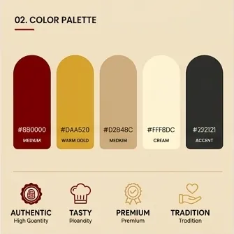
Vee’s City is a premium, traditional African snack brand known for its delicious Chinchin Villa snacks. The challenge for a food brand like this is to feel rooted in tradition and still look premium on a shelf, on a menu and on a phone screen. Four brand values guide the design: Authentic, Tasty, Premium and Tradition.
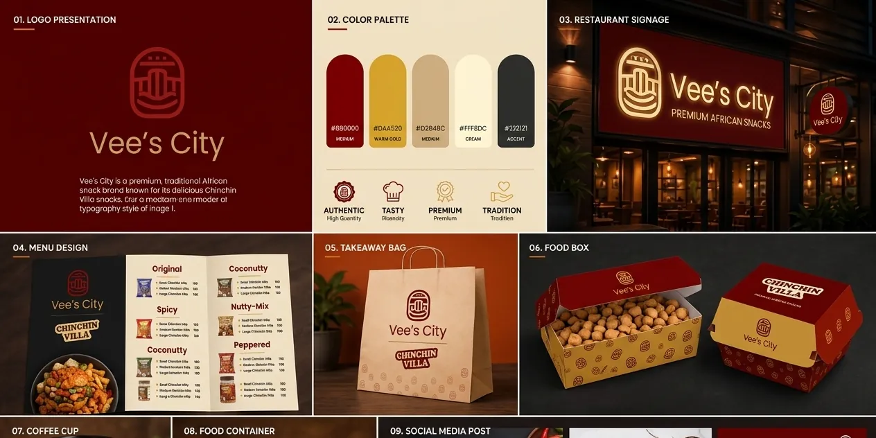
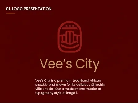
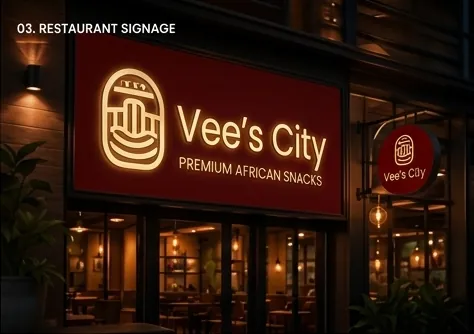
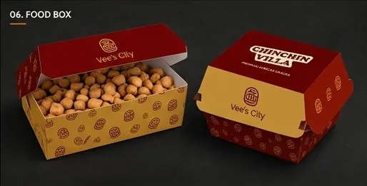
The emblem is a rounded, arch-shaped badge built from layered lines, a mark that feels crafted and traditional, like a seal of quality. Paired with a refined wordmark in warm gold on deep maroon, it gives the brand a confident, premium presence. A repeat pattern made from the emblem becomes a signature texture across packaging.
The same system runs from the street to the table.
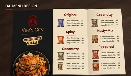
Vee’s City illuminated restaurant signage: Premium African SnacksVee’s City menu with the Chinchin Villa range: Original, Spicy, Coconutty, Nutty-Mix and Peppered
The menu organises the Chinchin Villa range by flavour (Original, Spicy, Coconutty, Nutty-Mix and Peppered), so choosing is quick and each flavour has its own identity.
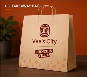
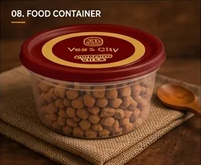
Vee’s City kraft takeaway bagVee’s City red and gold food boxes with the emblem patternVee’s City coffee cupVee’s City food container with gold label
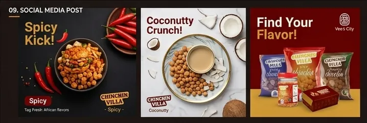
Bold, appetising social posts, such as “Spicy Kick!”, “Coconutty Crunch!” and “Find Your Flavor!”, put the products first and keep the palette and the emblem in every frame.
Vee’s City social media posts for the Chinchin Villa range
We use a small cookie to remember this choice. With your OK, we’d also use Google Analytics to see which pages help people, so we can make them better. Nothing is sold, and you can change your mind any time. Read the cookie policy.