Logo / Colour / Brand applicationsMedia · Audio & video
Technology · Productivity
Deepdive is a brand for smarter tools and curious people. The identity pairs a confident red check badge with a clean black wordmark to say one thing clearly: reliable, productive, and built to help you discover more.
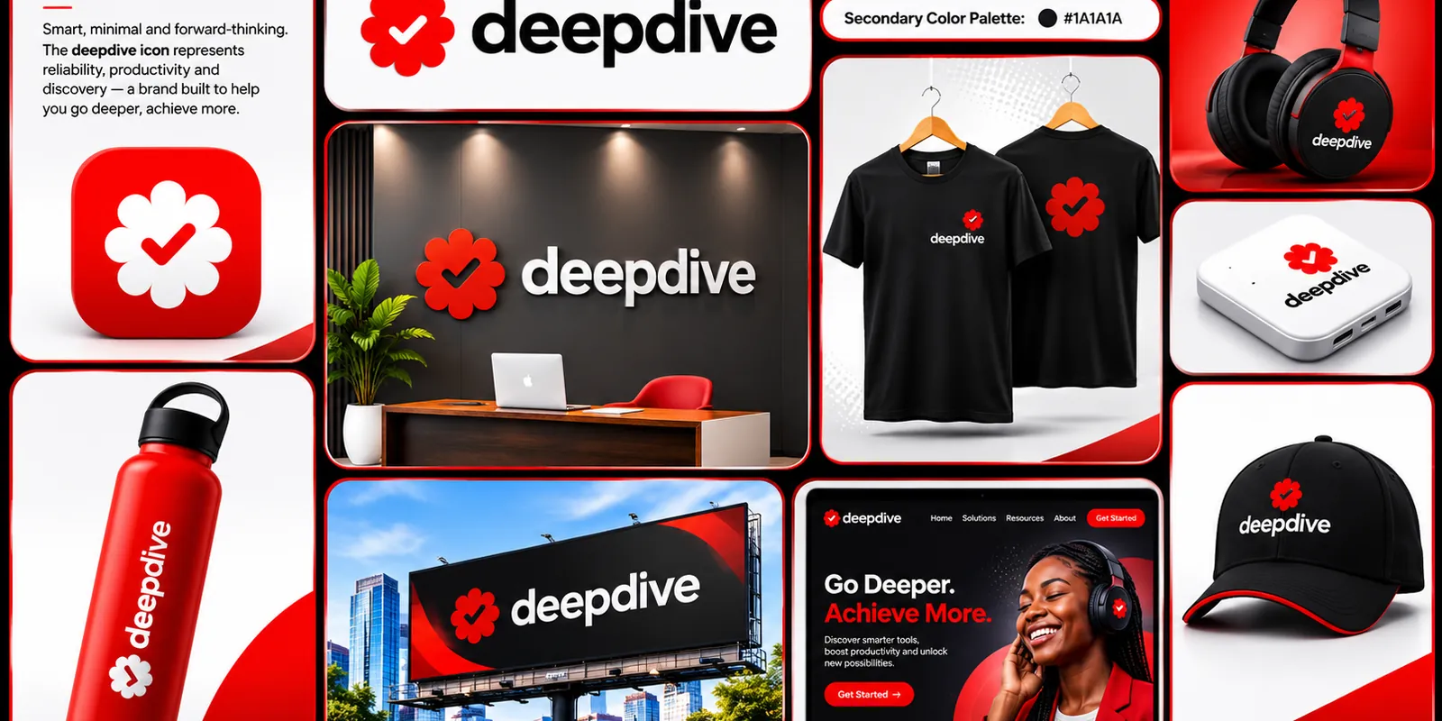
Deepdive is positioned around reliability, productivity and discovery. Its line, “Go Deeper. Achieve More.”, sets the tone: smart, minimal and forward-thinking, helping people look past the surface and get more done. The site copy continues the idea: discover smarter tools, boost productivity and unlock new possibilities.
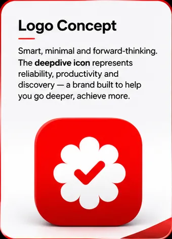
The icon is a scalloped badge with a bold check mark inside. The check says done, verified, dependable; the soft, rounded scallops make it warm and approachable rather than corporate. Paired with a heavy lowercase wordmark, it reads instantly and holds up on a tiny app tile as well as on a wall.
A strong, single-minded palette:
Red and black on white gives high contrast and high recall. The restraint is deliberate: one loud colour, used with discipline.
The identity was tested across everyday touchpoints so it works wherever people meet it.
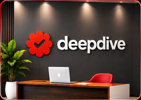
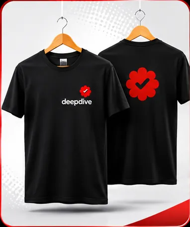
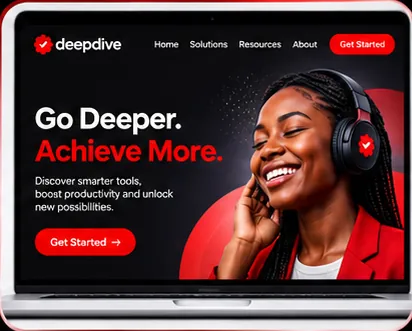

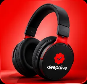
Other applications in the system include branded headphones, a bottle and a cap.