Logo / Colour / Brand applicationsTechnology · Productivity
Media · Audio & video
AudiBoo is a media brand about listening, watching and making. Its wordmark hides the idea in plain sight: a play button for the “D” and two screen-like shapes for the double O.
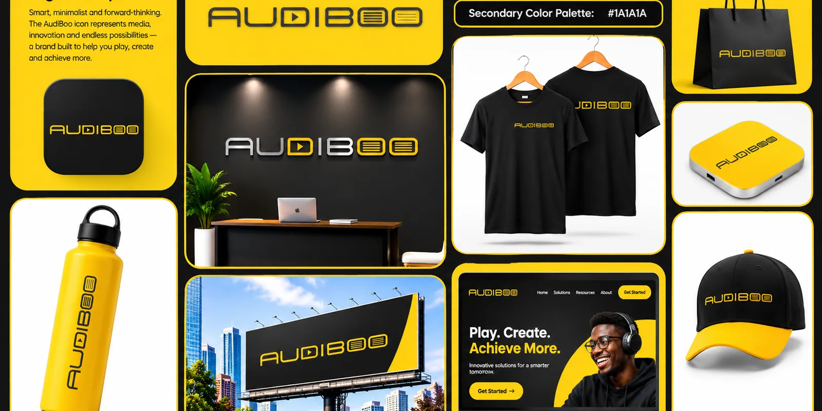
AudiBoo stands for media, innovation and endless possibilities: a brand built to help people play, create and achieve more. The messaging is upbeat and direct: “Play. Create. Achieve More.” and, on the product side, innovative solutions for a smarter tomorrow.
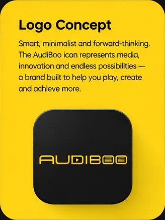
The wordmark is drawn as custom, squared letterforms. The D carries a play triangle, and the two Os become screens with scan lines, so the name itself says “audio” and “video” without needing a separate icon. Because the logo is a wordmark, the brand is recognisable even when only a few letters are visible, on a cap brim, a bottle or a tee.
Yellow on black is one of the highest-visibility pairings there is. It feels like a stage light: optimistic, loud in a good way, and impossible to miss on a street or a screen.
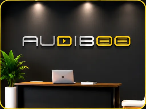
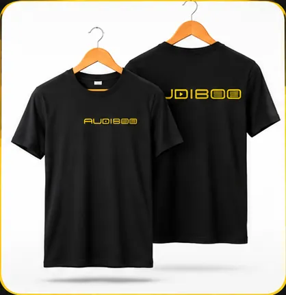

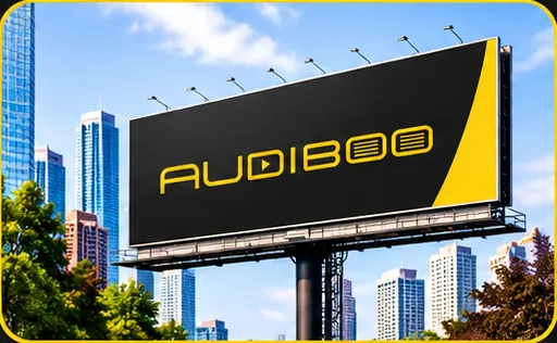
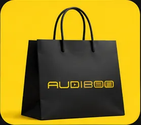
The same colours carry onto a tote bag, a bottle and a cap, so the brand feels consistent whether it is on screen or in someone’s hand.