Hofficy: a lime-and-black identity for smarter work
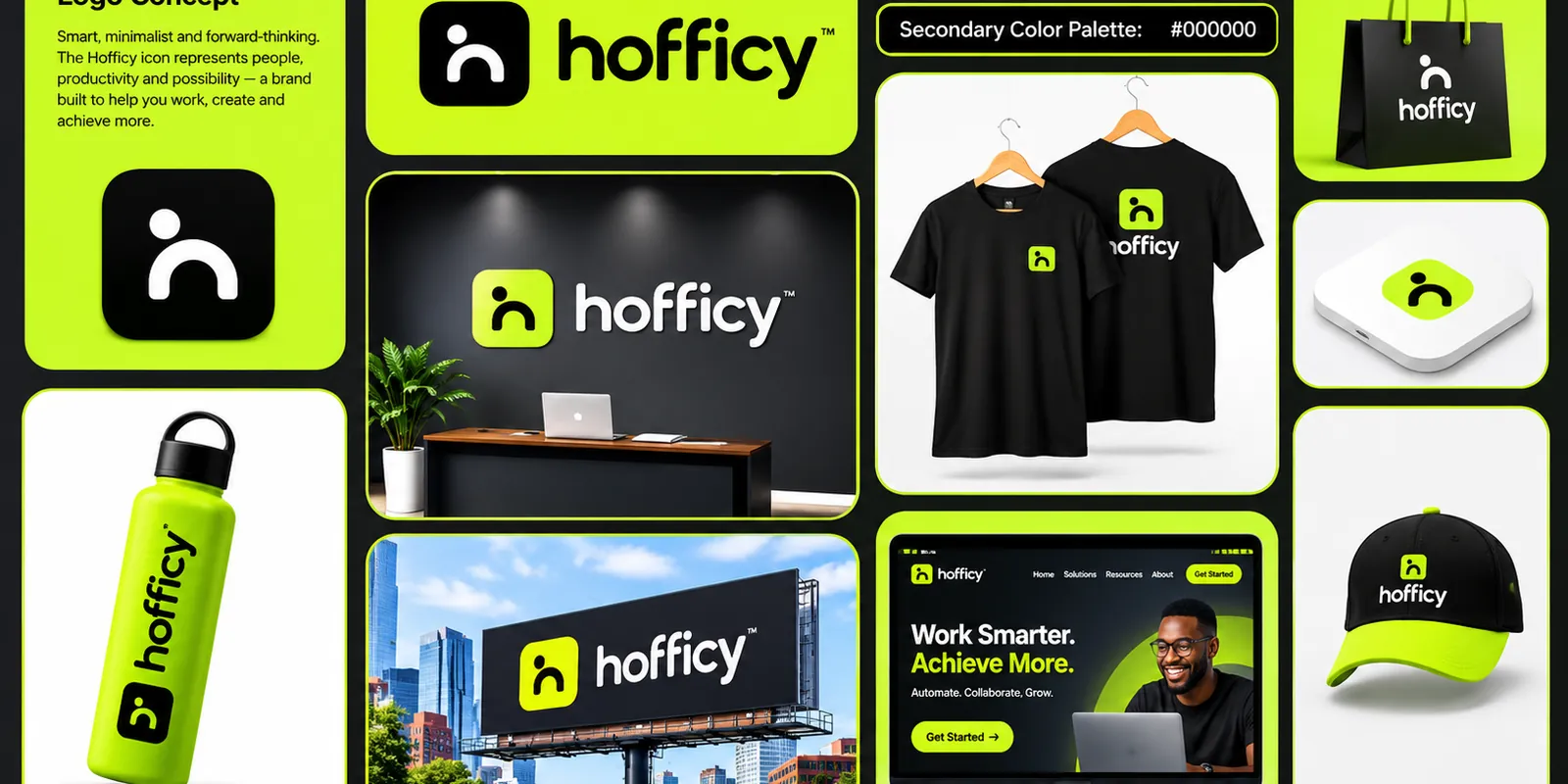
Hofficy is about people, productivity and possibility. The identity turns a simple, human figure into a friendly app icon and wraps it in a high-energy lime and black palette.
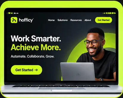
Hofficy is built to help people work, create and achieve more. Its messaging is short and practical: “Work Smarter. Achieve More.” followed by three verbs that describe the product promise, Automate. Collaborate. Grow.
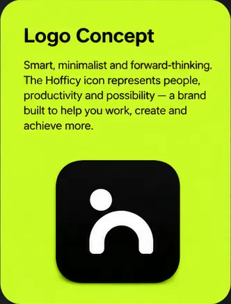
Hofficy logo concept: a person-shaped icon on an app tile
The icon is a minimal figure: a round head above an open arch, reading as a person and as the letter “h” at the same time. Placed inside a rounded square, it is ready to be an app icon from day one. The wordmark is set in a bold, lowercase geometric sans with a small ™, friendly, confident and very legible.
Primary: #AEFF00, an electric lime that feels fresh and energetic.
Secondary: #000000, pure black for contrast and focus.
Lime on black is bold and modern, the opposite of a grey, corporate office. It gives the brand a clear, ownable look in a crowded workplace-software space.
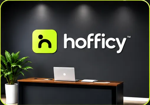
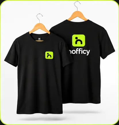
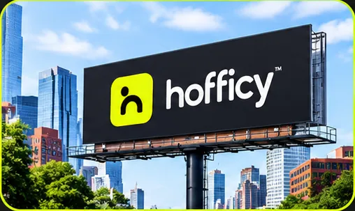
Hofficy reception wall with a lime icon and white wordmarkBlack Hofficy t-shirts with lime icon printHofficy website concept: “Work Smarter. Achieve More.”Hofficy billboard in a city setting
The system also extends to a tote bag, a bottle and a cap, all using the same icon and two-colour palette.
We use a small cookie to remember this choice. With your OK, we’d also use Google Analytics to see which pages help people, so we can make them better. Nothing is sold, and you can change your mind any time. Read the cookie policy.