Logo / Colour / Brand applicationsTechnology · Productivity
Fintech · Global trade
Money that crosses borders should feel as quick as a message. Flashspend is an identity for a fintech that promises to be fast, secure, smart and seamless, and to look the part from the first glance.
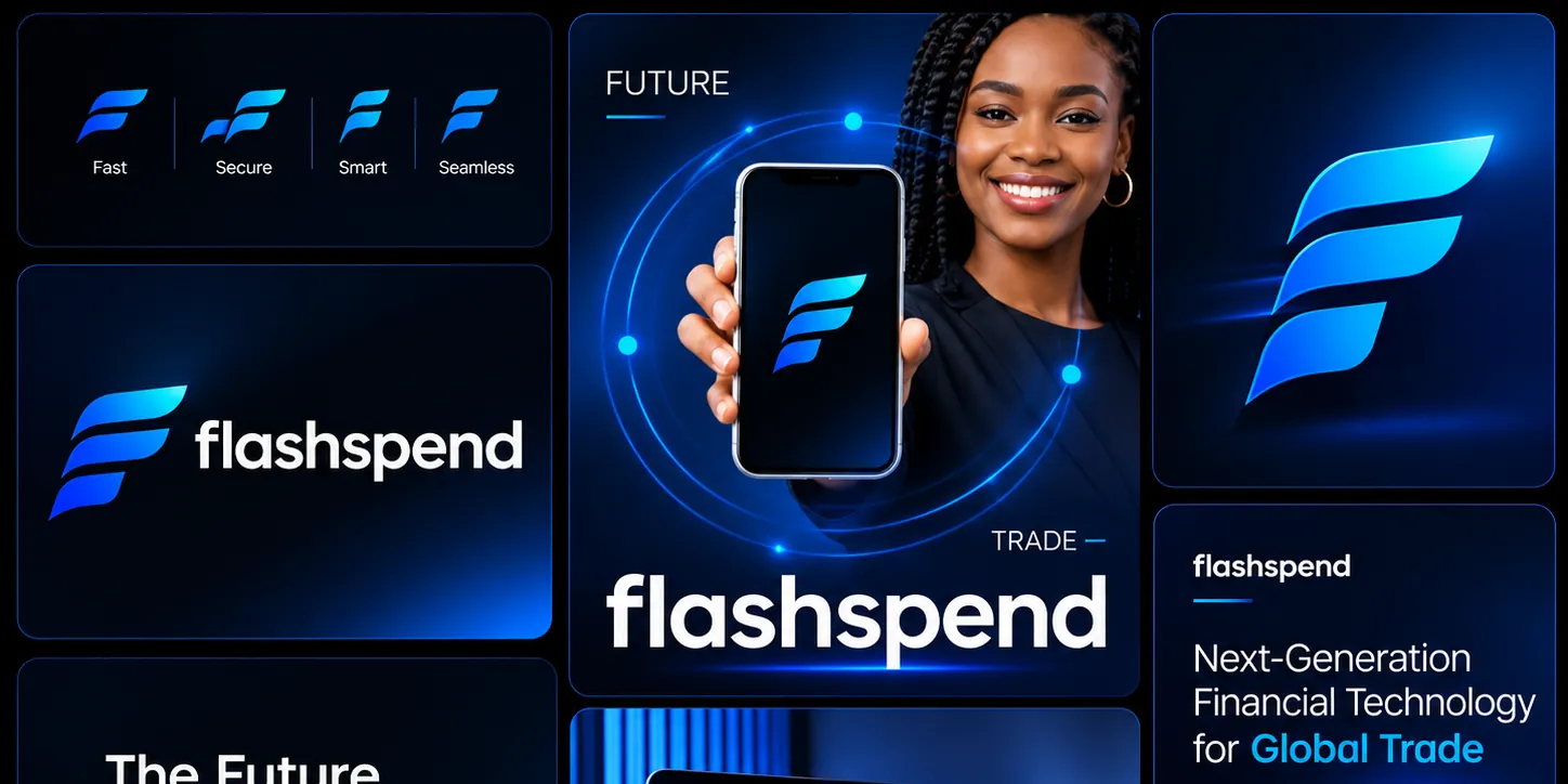
Flashspend is positioned as next-generation financial technology for global trade. The brand has one job to do on screen and in the hand: make moving money across borders feel instant, safe and effortless. Four words sit behind everything it says and shows: Fast, Secure, Smart, Seamless.

The mark is a bold F built from three swept strokes. The stacked, forward-leaning blades suggest motion and momentum (the “flash”), while the clean, layered shape keeps it calm and trustworthy enough for a financial brand. It works large as a hero symbol and small as an app icon. Beside it, the wordmark is set in a lowercase, rounded geometric sans: friendly, modern and easy to read at any size.
Deep midnight blue carries the brand, lit by electric cyan and cobalt gradients. Dark surfaces signal seriousness and security; the glowing blues add energy and a sense of technology that is alive. Light flares, orbit lines and a dotted world map reinforce the idea of a network that spans continents.
The language is short, confident and benefit-led:

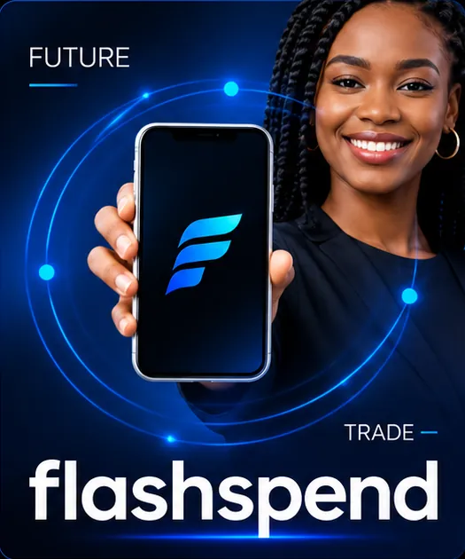
The system is designed to travel from a campaign image to a product screen without losing its character.
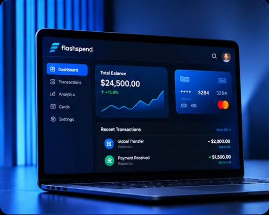
The product dashboard keeps the same dark, glowing language: a clear balance, a simple growth line, a card, and a short list of recent transactions, so the interface feels like part of the same brand.