
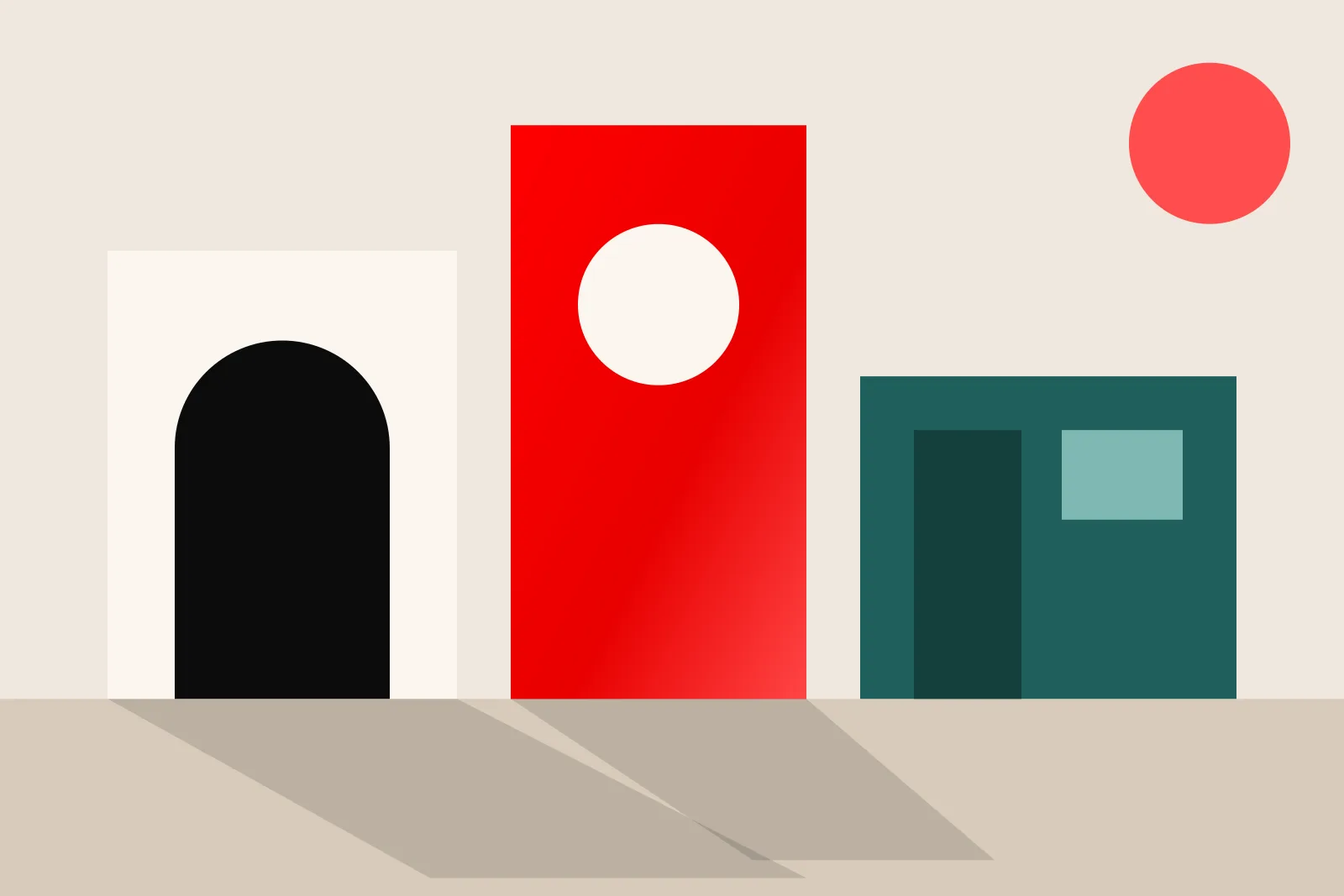
Somewhere in almost every design project there's a moment when someone says, "What if we added…?" Another colour. Another animation. Another line explaining the line above it.
More feels like progress. Often it's a way of dodging a harder question: what actually matters here?
Restraint is about order#
Minimalism is a look. Restraint is a habit of deciding. A bright, loud, expressive brand can still be restrained if everything in it has a job.
So the question isn't "what else can we remove?" It's "does this help someone understand, feel or do something important?" Sometimes the answer is yes and the design needs one more cue. Sometimes it just needs more space.
Make fewer choices, on purpose#
Start with the person and the task. What should they notice first? What do they need to know second? What should they do next? Then make your type, spacing and colour serve that order and nothing else.
A small set of well-chosen elements is easier to recognise and easier to keep consistent. It also leaves room for one distinctive gesture to be remembered, whether that's a typeface, a way of cropping photos or a bold use of scale.
The strongest work isn't the work with the fewest parts. It's the work with the fewest unnecessary ones.
Knowing when to stop#
Check your design against its purpose, not against your nerves about it looking too plain. Do people understand it? Is it readable and accessible? Does the main message survive when it's tiny? Stopping is a creative decision too.

Join the conversation